
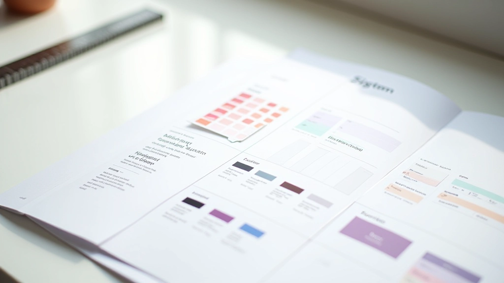
Why Design Tokens Matter More Than You Think
You've got a design system. Maybe it's in Figma, maybe it's documented somewhere. But here's the thing — if your team isn't actually using it, it's just pretty pictures on a screen.
Design tokens change that. They're the bridge between designers and developers, between your design vision and the actual product. When done right, they reduce decision fatigue, eliminate guesswork, and keep everyone working from the same playbook.

What Actually Goes Into Your Token System
A token system isn't just colors. It's everything your team needs to make consistent decisions fast. We're talking about colors — obviously. But also typography scales, spacing increments, shadows, border radius values, animation timings.
Here's what works: Start with your most-used decisions. If your designers are constantly choosing between 5 or 6 colors, that's your starting point. If you've got 8 different font sizes floating around, that's your typography tier. The goal isn't to be comprehensive on day one. It's to capture the decisions you're actually making.
- Color tokens: Primary, secondary, neutral grays, semantic colors (success, warning, error)
- Typography: Font families, size scale (6-8 sizes), line heights, letter spacing
- Spacing: Consistent increments (4px, 8px, 12px, 16px base system)
- Shadows: 2-4 elevation levels for depth
- Border radius: Small, medium, large, full-round variants

Informational Note
The approaches discussed here are based on industry best practices for design system implementation. Every team's token structure will differ based on their specific product needs, scale, and technical constraints. Consider consulting with your design and development teams to determine what structure works best for your organization.

Naming Conventions That Don't Make You Cringe
This is where most systems fall apart. Your tokens need names that make sense six months from now when someone new joins the team and has no context.
Use a three-tier naming system. The first tier is the category (color, spacing, typography). The second tier describes what it is (primary, secondary, heading). The third tier is the property (base, hover, disabled). So you get something like
color-primary-base
or
spacing-md
or
typography-heading-lg
. This scales naturally and doesn't require documentation to understand.
Don't name tokens after their appearance. Don't call something
color-blue-500
or
spacing-large
. When you rebrand and blue becomes teal, you've got a naming crisis. Use semantic names that describe function, not appearance.
color-primary
works.
color-interactive-default
works.
color-blue-500
doesn't.
Getting Your Team to Actually Use Them
Here's the hard part: tokens only work if people use them. You can have the most beautiful token system ever designed, but if designers are still picking custom colors and developers are hardcoding values, you've failed.
The secret? Make them easier to use than not using them. In Figma, that means setting up local variables tied to your tokens. Make them visible in the design panel. When a designer needs a color, the token should be the first thing they reach for. Don't make them dig through documentation.
For developers, export your tokens to JSON or CSS variables. Integrate them into your build process. If a developer can just type
var(--color-primary-base)
instead of hunting for the hex value, they will. Make the adoption path frictionless.
Start small. Pick one component type — buttons, for example. Build it with tokens. Show your team how it works. Then expand from there. You don't need perfection. You need momentum.


Scaling Without Chaos
As your product grows, your tokens will need to grow with it. But here's the thing — don't try to predict everything upfront. Add tokens as you need them. When you start designing dark mode, add dark-mode token variants. When you add a new color to the brand palette, add tokens for it.
Set up a review process. Someone (maybe your design system owner, maybe a rotating design lead) reviews new token requests before they get added. This prevents token sprawl — where you end up with 47 shades of gray and no one knows which one to use.
Document why tokens exist. Not just what they are, but why you created them. This context helps future decisions. "We have this extra spacing token because mobile components needed tighter density" tells a story. It helps people understand the system's logic.
Start With What You Have
You don't need a perfect token system. You need a working one. Look at your design decisions right now. What colors do you actually use? How many font sizes are in your designs? What spacing values appear most often?
That's your starting point. Document it. Set it up in Figma. Share it with your team. Then iterate. Add tokens as you need them. Refine your naming if it's confusing people. Kill tokens that nobody uses.
A token system isn't a one-time project. It's a living document that grows with your product. The best systems are the ones teams actually use because they make work easier, not harder. That's your goal. Make consistency the path of least resistance.