

Creating Flexible Component Variants for Every Use Case
How to build button, card, and form components that adapt to different sizes and states without creating component bloat.
Step-by-step process for organizing buttons, inputs, and cards into a reusable system. Covers naming conventions and folder structure that actually works.
July 2026

Building a component library isn't just for big design teams. It's actually one of the smartest moves you can make early on — saves time, keeps designs consistent, and makes handoff to developers way smoother.
The thing is, most teams overthink this. They create massive libraries with hundreds of variants before anyone's actually using them. We're going to skip that. Instead, you'll build something practical that grows with your team.

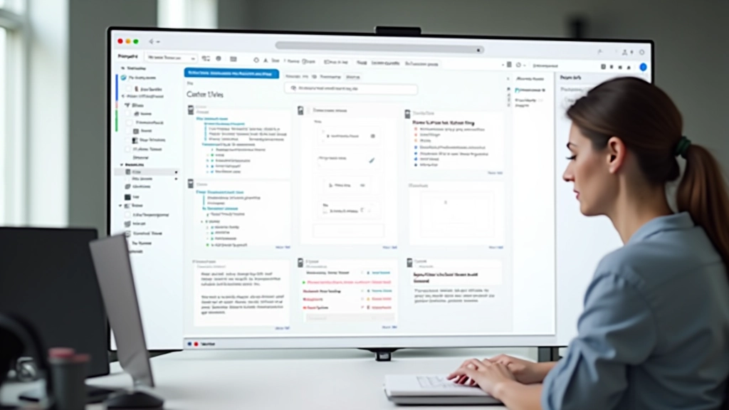
Before you create a single component, you'll want to set up your file structure. Create a new file in Figma — call it something like "Design System" or "Component Library". Don't overthink the naming. You'll rename it later if needed.
Inside that file, create pages for each category. You're looking at roughly 4-6 pages to start: Buttons, Inputs, Cards, Navigation, Typography, and Colors. Keep it lean. You can add more later.
Use a naming convention from day one. Something like "Button/Primary" and "Button/Secondary" makes it way easier to find things later. Your developers will thank you.
Author
Editorial Team
Written by the ComponentVault Editorial Team, focused on practical guidance for building and scaling design systems in Figma.
This is where most people mess up. They use names like "Button Blue Big" or "Card 3" and wonder why they can't find anything six months later.
Use this pattern instead: ComponentType/Variant/State. So you'd have "Button/Primary/Default" and "Button/Primary/Hover". It's clear, searchable, and it scales. Your developers will know exactly what they're grabbing.
This guide provides educational information about establishing component libraries in Figma. The specific approaches and workflows described here are intended to serve as general guidance. Your team's implementation may vary based on project requirements, team size, and existing design processes. For specific use cases, consult with your design and development teams to ensure best practices align with your organization's needs.
Start with the basics. Don't build every possible variation right away. You'll create maybe 3-5 button variants first: Primary, Secondary, and Danger. That's it. You can add more when you need them.
For each component, set up main and component variants. Main variants control things like size (small, medium, large). Component variants handle states (default, hover, active, disabled). This gives you flexibility without creating 50 separate components.
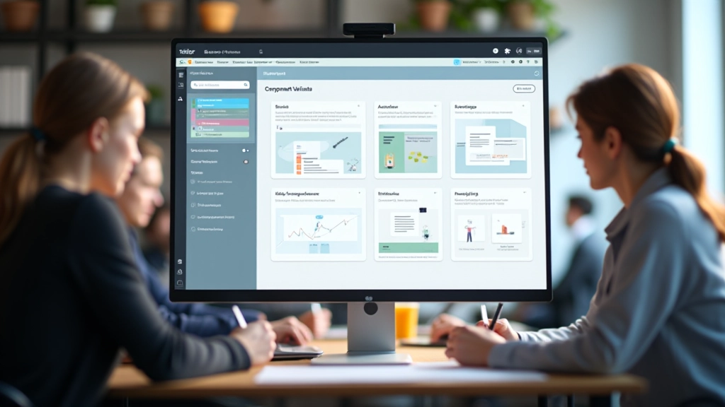

Once you've got your initial components set up, publish them. In Figma, go to Assets and publish your components. They'll be available to your whole team now. Anyone can drag them into their projects.
Don't worry about perfection here. Your first version won't be perfect, and that's fine. The key is getting it into people's hands so they can start using it. You'll refine things based on what people actually need.
Set up a shared doc or Figma board explaining what each component does and when to use it. Sounds simple, but this saves so much back-and-forth. Include examples of right and wrong usage if possible.
You've got the foundation now. Your component library is live, your team can access it, and you've got a naming system that makes sense. The hard part's done.
Over the next few weeks, you'll probably realize you need a few more components. That's expected. Add them as they come up. Document changes as you go. And definitely gather feedback from your team — they'll tell you what's working and what isn't.
Most teams find that once components are in place, design moves way faster. Less copy-paste, fewer inconsistencies, and developers are happier because they know exactly what they're building. It's worth the setup time.
Continue learning about design systems and component libraries
How to build button, card, and form components that adapt to different sizes and states without creating component bloat.
Documentation strategy for colors, typography, and spacing that reduces decision paralysis and keeps teams aligned.

Governance, version control, and update processes that scale. How to handle requests and keep the system healthy long-term.