SaaS Platform Design System
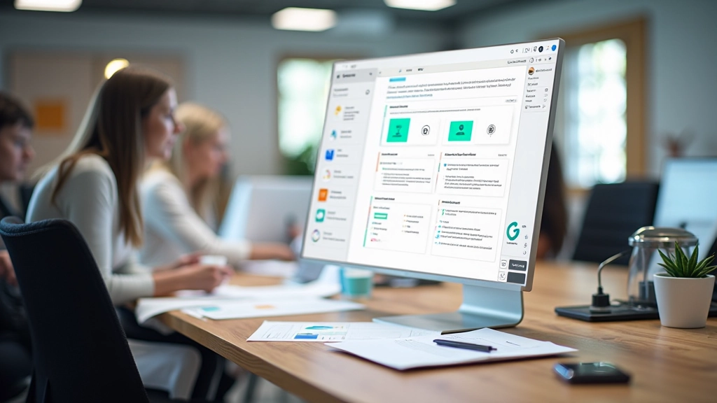
A complete Figma component library for a growing SaaS team in Edmonton. We documented components across 8 weeks, including buttons, forms, tables, and modals with full variant coverage for light and dark modes.

Real design systems built for teams like yours
A complete Figma component library for a growing SaaS team in Edmonton. We documented components across 8 weeks, including buttons, forms, tables, and modals with full variant coverage for light and dark modes.

Established a comprehensive design token framework for a digital agency managing multiple client projects. Created color scales, typography tokens, and spacing systems documented in Figma with clear naming conventions for seamless handoff to developers.
Audited a design team's scattered Figma files and identified redundant components. Over 6 weeks, we consolidated components, established naming conventions, and created a migration guide so the team could reorganize without disrupting ongoing work.
Built a reusable documentation template in Figma for a product design team. Includes sections for usage guidelines, do's and don'ts, code examples, and accessibility notes—everything designers and developers need in one place.
Let's talk about how we can help your team scale design with a component library that actually works for your workflow.
Get in touch