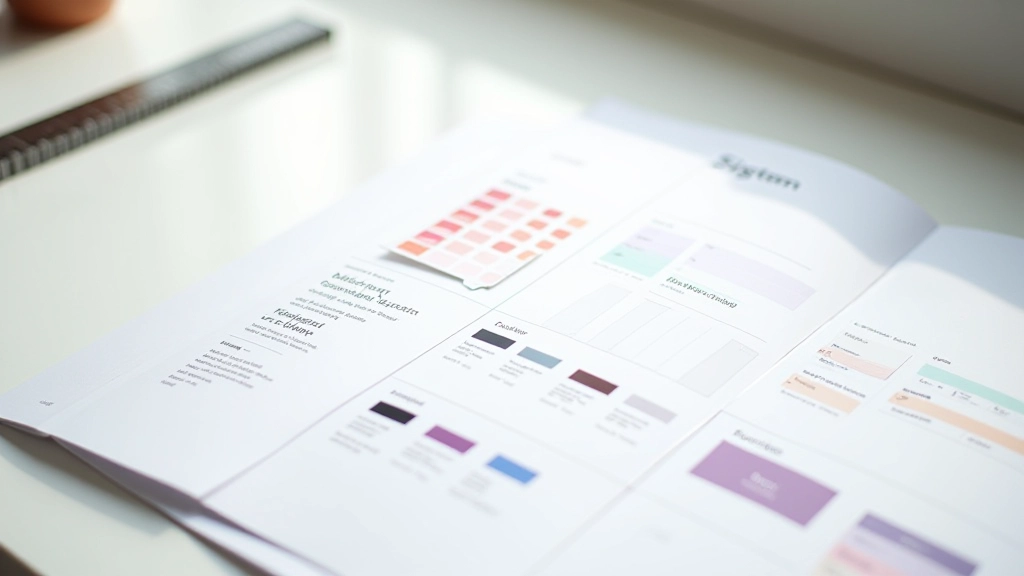

Setting Up Your First Component Library in Figma
Step-by-step process for organizing buttons, inputs, and cards into a reusable system. Covers naming conventions and folder structure that actually works.
Building scalable UI kits for Edmonton design teams. Learn how to create reusable components, maintain consistency, and streamline your workflow.
Step-by-step process for organizing buttons, inputs, and cards into a reusable system. Covers naming conventions and folder structure that actually works.
How to build button, card, and form components that adapt to different sizes and states. Real examples from Edmonton-based design projects.
Documentation strategy for colors, typography, and spacing that reduces decisions and keeps teams aligned. Includes templates you can adapt.
Governance, version control, and update processes that scale. How to handle requests for new components without chaos or decision paralysis.