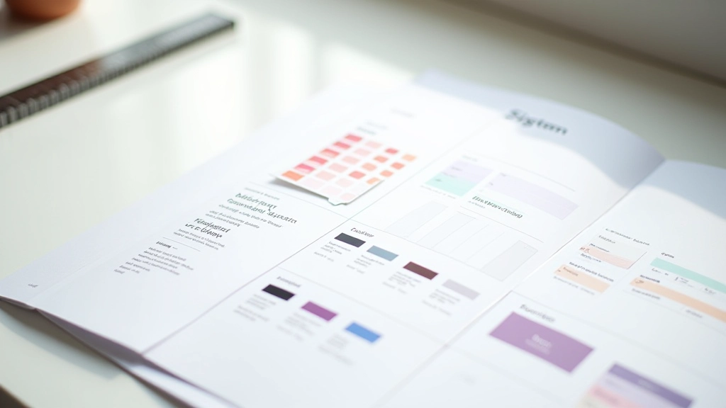

Why Variants Matter for Scalable Design Systems
Component variants are how you handle the variations of a single UI element without creating fifty different components. Instead of a Button, ButtonSmall, ButtonLarge, ButtonDisabled — you build one Button component with variants that control size, state, and style.
It's the difference between chaos and control. When your design system has proper variants, designers can build interfaces faster. They're not hunting through your library trying to figure out which of three similar buttons to use. The structure is clear.
Plus, when you need to update a button style, you change it once and it propagates everywhere. That's the real power here — consistency at scale.

The Variant Naming Convention That Actually Works
Don't name variants "Button Variant 1" or "State=Hover". Be specific. Use names like "Primary/Medium/Default" or "Secondary/Small/Disabled". Your team will know exactly what each one is for.
Structuring Your Component Architecture

Start with your base component. That's your Button, your Card, your Input field. This is the master instance that all variants branch from.
Then define your axes. An axis is a property that changes across variants. For a button, you might have three axes: Size (small, medium, large), Type (primary, secondary, ghost), and State (default, hover, active, disabled). That's 3 3 4 = 36 possible combinations. Manageable.
Don't try to create all 36 variants if you don't need them. Start with the ones your team actually uses. You can always add more later as your designs evolve.
Building Variants Step by Step
Create the Base Component
Build your button with all the properties you'll vary: fill color, text color, border, padding, size. Make it flexible with auto-layout so it adapts to content.
Set Up Component Properties
In Figma, go to the Design panel and add component properties for Size, Type, and State. These become your axes. You'll toggle these properties to create variants.
Create Main Variants
Duplicate your base component and adjust it for each axis. A small primary button, a large secondary button, a disabled state. Each gets its own variant branch.
Nest and Combine
Use nested components to combine variants. Your Size variant includes the Type and State variants nested inside it. This keeps the library organized and prevents explosion.
Real Examples: Button, Card, Input
Button Component
Axes: Size (small, medium, large), Type (primary, secondary, ghost), State (default, hover, active, disabled). You're looking at maybe 20-25 actual variants you'll use regularly. Don't create disabled ghost buttons if you don't need them.
Card Component
Axes: Layout (image-top, image-left, no-image), Elevation (flat, shadow, outline), Size (compact, default). Cards are flexible — they grow with content. Make sure your variants account for different content lengths.
Input Component
Axes: Type (text, email, password), State (default, focus, filled, error), Size (small, medium). Don't forget the error state — that's where a lot of designs fall apart.
Implementation Note
This guide covers design system structure and component organization in Figma. Actual implementation in code (React, Vue, etc.) will differ based on your tech stack. Work with your development team to ensure your variant structure maps cleanly to your component library.
Getting It Right From the Start
The teams that move fastest aren't the ones with the most components. They're the ones with the most thoughtfully structured variants. Spend time upfront defining your axes and naming conventions. Document it. Share it with your team.
A well-designed variant system saves hours every week. Designers stop guessing. Handoff to developers becomes clearer. Updates propagate faster. That's worth the investment.
Start with buttons and cards. Get those right. Then expand to your form inputs, navigation, and everything else. You'll build momentum as you go.
Ready to Dive Deeper?
Check out our guides on component library setup and design token documentation to complete your design system foundation.
Explore Component Library Setup