
ComponentVault Logo ComponentVault Contact Us
Contact Us

Figma Component Libraries & Design Systems

Building scalable UI kits for Edmonton design teams. Learn how to create reusable components, maintain consistency, and streamline your workflow.

4 Articles

Featured Guides

Designer working at desk with tablet, sketching component layouts and design patterns

Setting Up Your First Component Library in Figma

Step-by-step process for organizing buttons, inputs, and cards into a reusable system. Covers naming conventions and folder structure that actually works.

12 min Beginner July 2026

Read Guide
Multiple Figma frames showing component variants and states displayed on computer screen

Creating Flexible Component Variants for Every Use Case

How to build button, card, and form components that adapt to different sizes and states. Real examples from Edmonton-based design projects.

10 min Intermediate July 2026
Read Guide
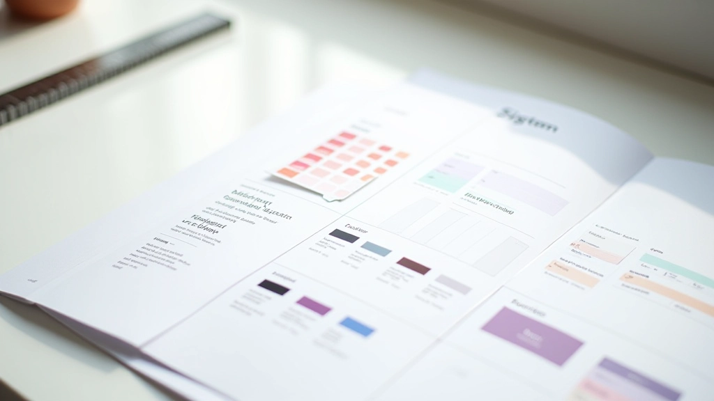
Design system documentation with color palette, typography scale, and spacing guidelines laid out clearly

Building Design Tokens That Your Team Actually Uses

Documentation strategy for colors, typography, and spacing that reduces decisions and keeps teams aligned. Includes templates you can adapt.

14 min Intermediate July 2026
Read Guide
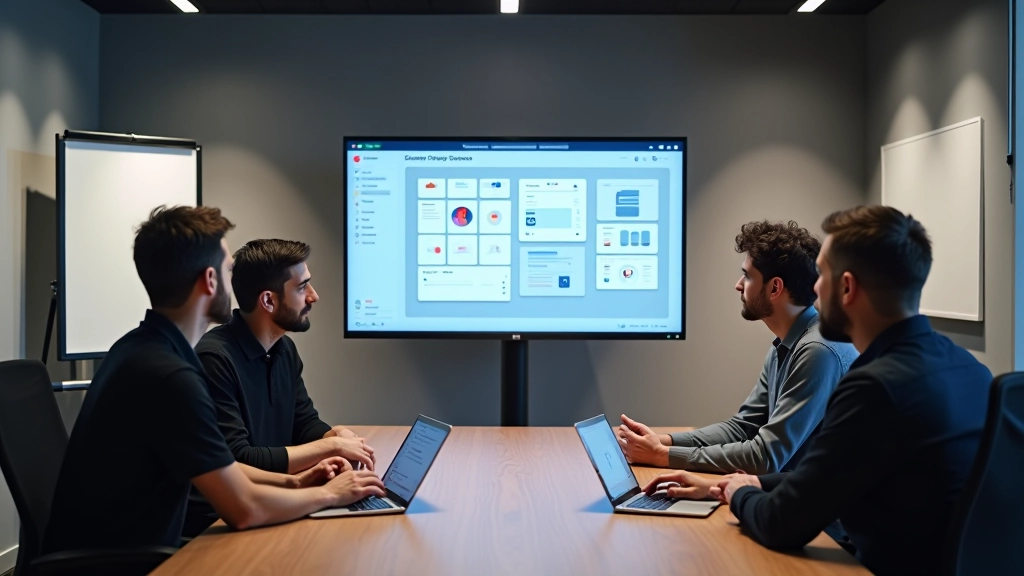
Team collaboration view showing multiple designers reviewing and updating shared Figma design system library

Maintaining Your Design System as Your Team Grows

Governance, version control, and update processes that scale. How to handle requests for new components without chaos or decision paralysis.

11 min Advanced July 2026
Read Guide

Browse by Topic

Component Variants Design Tokens UI Kit Documentation Figma Best Practices Naming Conventions Team Collaboration Scalable Systems Component Library Setup Design Consistency Asset Organization Version Control Handoff Workflows